
Introduction
A sales dashboard is a management tool that is used by the sales organisation to monitor the performance of the selling team through a set of graphical presentations that portray various aspects of business statistics. Learn how to create an attractive sales dashboard template to track key metrics, improve decision-making, and improve your team’s performance.
This allows the head of sales and other team managers to obtain a general view of the team’s activity. Sales departments are rather dynamic since they are goal-oriented. Thus, sales management and representatives rely on such detailed information about their performance and their team’s performance on a daily basis in order to modify strategies if necessary.
The sales dashboard aids the sales departments to achieve the targeted sales and possibly look for sales opportunities through Sales Performance Analysis, Funnel Analysis, Sales Ratio and Sales Phases. Also, the professional sales funnel and the performance dashboard evaluate the sales growth with the use of superior sales dashboard software.
The sales team can easily work through such sales tasks using this tool, at the same time achieving the objective of enhancing the sales revenue and overall profit levels while also predicting concepts that might alter the precise objectives and comparing information in a smooth and efficient manner.
Key elements of an effective sales dashboard
Essential metrics to track
- Sales Pipeline
Sales Pipeline informs you more of the status at which the opportunity has reached. This information is of utmost importance when planning for the conversion of leads. This means that when you follow the leads and opportunities on their different stages, you are able to move through the funnel properly.
- Customer Acquisition Cost
Customer Acquisition Cost is the measure of the total amount spent and the total number of customers gained. These together with Customer Lifetime Value (LTV) and Average Revenue Per Unit (ARPU) identify the profitability.
Customer lifetime value (CLV). The total value of a customer to a business organisation in terms of their patronage of the brand. CLV is typically determined by past sales data of your client and estimated future revenues from the same client
- Sales volume and revenue
Sales revenue measures enable you know how much you are making concerning your sales and if it is meeting certain set goals and projections. Some of the popular indicators for measuring the revenue include growth in the revenues, revenues per rep, per customer, as well as revenues by products or services.
- Sales conversion rates
When you create any dashboard for sales, some important figures need to be exposed such as conversion rates of sales. Following conversion rate works as an indication to measure the needed and effective conversion ratio and helps in identifying the loop holes in the sale cycle and modifying the conducive strategy for generating more revenues. It is a very important aspect that shows the extent of the conversion of sales’ activities to actual sales.
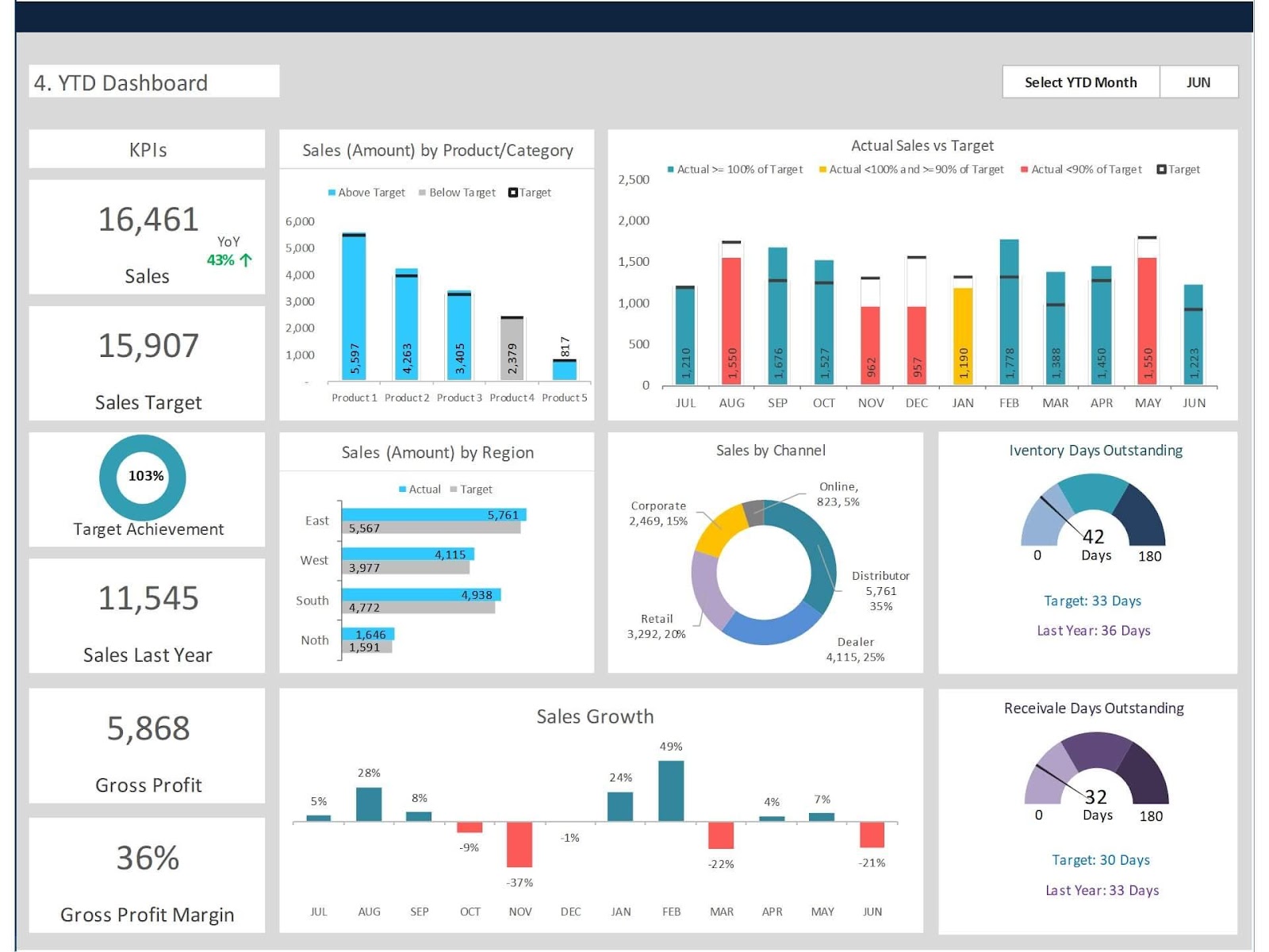
Visualisation and charts
- Bar and line charts for trends
Some of the worksheets that should be included in the design of a template for a sales dashboard include visualisations and charts in which the most important information can be viewed at a glance. Bar and line charts are specifically used for time series data so that the users can get a clear picture of how things are changing. End-users can easily understand data and take relevant actions to boost the sales through presenting data through color coded charts and graphs.
- Pie charts for proportions
Comparing with bar and line charts, pie charts are equally important to be included in the sales dashboard for showing proportions and distribution of certain elements. Pie charts mainly compare the proportion of each category in the entirety of the dataset and are beneficial in understanding sales distribution by products, geographical areas or customers. Through precise indications of proportions, pie charts contribute to the improvement of decisions by showing where to focus and where to improve.
- Gauges performance against target
The other crucial aspect that should be included in any sales dashboard is the use of the gauge to determine the degree of compliance towards the specific goals. The use of gauges to depict the existing performances relative to specific standards offered a clear perspective on the sales team’s performances. Gauges are useful in that the user is able to pinpoint places that may be under or over performing, and get things back on track with reference to strategy.
Steps to Create a Sales Dashboard Template
Identify your team’s need
To develop the sales dashboard template, begin with the following steps; identify and recognize the main issues for the present sales processes’ execution, it is important to assess them thoroughly. Some of the well-known KPIs include the conversion rates, the company’s revenue growth, and the customer acquisition cost that comes with the requirement.
Choose the Right Tools and design your dashboard layout
Take the right tools into consideration such as MS Excel, Google spreadsheet, or Microsoft Power BI to create a template of sales dashboard. The layout of the dashboard should be clean making sure it follows the best practices in the design of a dashboard. Data should be organised, the use of graphics and other tools should be explicit, and the structure should enable a quick and easy searching of important, at a glance, information.
Populate Your Dashboard with Data
To make use of your completed sales dashboard template, compile and assimilate data into the framework obtained from different sources. Ensure that the data being used to develop the dashboard is accurate and reliable to be in a position of providing the right information. Always ensure that you check your figures and use good data validation so as to ensure that you are accurate with your sales data collected.
Customise and Optimise
You should make changes and adaptations to correspond with your particular and unique sales processes regarding the default template and design of the sales dashboard. Augment it with filters so that a person can follow the drill-down path to get other features and detailed information. Promote adaptability to changes in business requirements that can govern interaction between users and tools for the purposes of data examination and decision-making. Revise the content of the dashboard consistently in order to maintain the most important and useful structure of the work.
Best Practices for Using Sales Dashboards
Regular Updates and Maintenance
General tips for increasing the efficiency of sales dashboards include the necessity of timely update and maintenance. It’s proposed to carry out data updates automatically so that the data always stays up-to-date and reliable. The performance of regular checks in form of review and audit can help indicate any changes that need to be made more frequently to keep the dashboard updated and accurate. Explore Biz Infograph sales dashboard package which includes sales team dashboard, salesperson performance dashboard, sales budget vs actual dashboard, sales KPI dashboard, sales pipeline dashboard and more.
Training Your Team
To guarantee the team’s efficient use of sales dashboards, conduct thorough training sessions. Explain what the learners should do with the data and show them how different features of the dashboard work. Implement a process of feedback collection to determine possible problems with website usability and ensure the constant development of your sales team.
Common pitfalls to avoid
Overloading with too much data
Do not flood your sales dashboard with too much information as it will only clutter up the display. The main core of it is to be kept rather simple and contain only those KPIs that will be most relevant to the business objectives. Maintain the simplicity of the dashboard and refrain from overwhelming the users with irrelevant pieces of information to help them make the right decisions to boost sales.
Ignoring user feedback
Do not commit the mistake of not following the user feedback in the creation of the sales dashboards. On this basis, show interest in their activity and stories, as well as in the recommendations regarding the improvement of its work. The best practices for the user interface and perceived effectiveness suggest that the following changes should be made based on the feedback: In this way, the dashboard should be modified with regards to the user needs and preferences for it to performed at its best.
Conclusion
Sales dashboard is a key tool that can be used to analyse the performance of the sales team, make decisions, and help the success of the business. Thus, it is pivotal for controlling critical outcomes, analysing shifts to better recognise opportunities or threats in real-time.
The necessity of maintaining the existing sales dashboard template and developing new drafts, derives from the fact that such working tool has to be aligned with various business objectives and user requirements. Taking into consideration the activity updates, users’ feedbacks, and changes, it remains actual and helpful for teams to improve the sales plans, raise organisational performance, and obtain positive results.
The effective management of a sales dashboard in the end proves to be very beneficial in increasing organisation’s efficiency, profitability, and competitiveness in the market.